Logo & Brand Redesign:
Rental Property Management Hawaii LLC
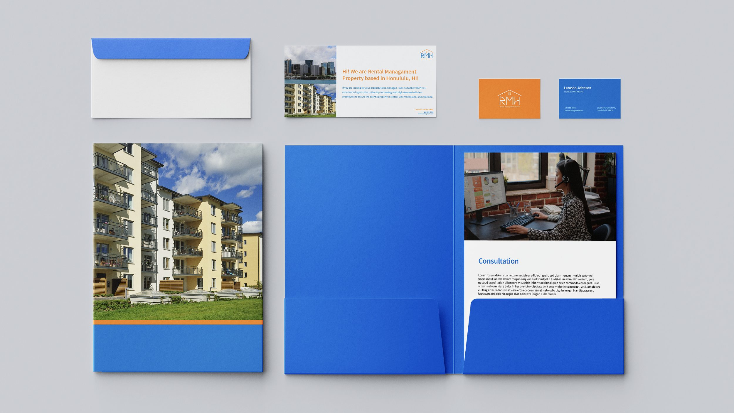
The goal of the rebranding initiative was to create a consistent and visually engaging brand identity that is reliable and organized. This was achieved by incorporating a minimal logo and bright colors, high-quality images/visuals, and a clean and modern design logo. As a result, it creates a more appealing experience for customers, enabling them to engage with the company more confidently, as they feel assured that the services provided will meet high-quality standards and procedures.
Rental Management Hawaii is dedicated to providing professional property management services to property owners in Honolulu, Hawaii. The company's range of services includes everything from marketing and advertising properties to tenant screening and selection, lease agreement management, maintenance and repair handling, and providing regular updates and reports to property owners.
Rebranding Process of RMH
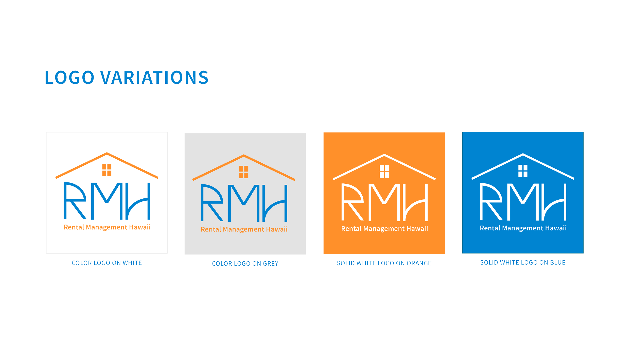
During the rebranding process, I made the strategic decision to shorten the company's name to Rental Management Hawaii and redesigned the logo to create a more modern, cleaner, and symmetrical aesthetic. The new logo is meant to reflect a corporate and structured identity for the company, and I chose to incorporate the color orange from the previous logo, as it is reminiscent of the beautiful sunsets in Honolulu. I also selected blue to represent the stunning beaches in Hawaii and to create a cohesive color palette that captures the essence of the company's location.


